Hi all,

I just completed some samples for my wedding-coat fabric (coat fabric project posted on Weavolution here: http://www.weavolution.com/node/6458 ), and am wondering what spacing I should use on the motifs.  I wove a gamp with various spacing, and posted the resulting samples  here.  (Please ignore the white vertical stripes, they're a threading error - I'm just trying to evaluate the spacing.)

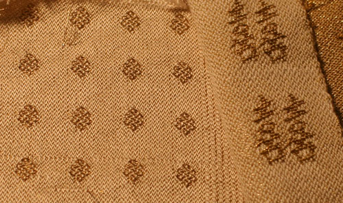
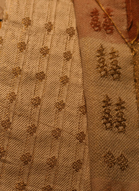
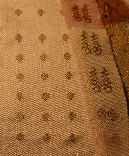
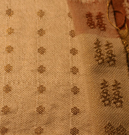
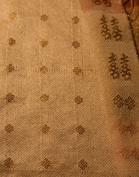
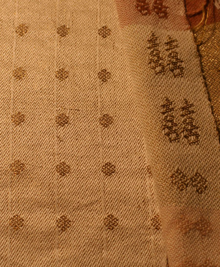
Please take a look and let me know which ones you think go best!  I'm partial to the second and last samples, but would love to hear what people like and why.  I have to decide in the next few days which spacing to warp up for.  I will be weaving 25 yards of 23" wide fabric for this coat, so I had better like the end results!

Anyway, if you can take a look and tell me what you think, I'd appreciate it.  And do check out my two other wedding-dress projects on Weavolution:

Wedding dress fabric (completed)

Double happiness ribbon for the coat (yet to be woven)

Let me know which spacing you think looks best!

Tien

Comments

bolivian warmi

Oh it's gorgeous. I like medium vertical, wide horizontal-sorry can't tell you why!

Laverne

Sara von Tresckow

Just eyeballing them, the first one makes me come back more often.

Why are there stripes in the other samples? They distract.


Lovely pattern and yarn choice.

tien (not verified)

Hi Sara,

The stripes are an error in the threading - sorry, I should have mentioned that earlier!

Sara von Tresckow

 The stripes aside, I still like the first version - it just looks really really nice.

Caroline (not verified)

I think I prefer the first one too - it may have something to do with the stripes, but I think its because its the most symetrical and has a good balance.

weaverbird53 (not verified)

Such beautiful fabric!  I like the last one best. Making the vertical spacing greater than the horizontal seems to fit most comfortably with the happiness ribbon, to my eye.

crosstownshuttler (not verified)

Hi Tien,

I like the last one best. Having the horizontal spacing closer than the vertical spacing seems slimming and in keeping with the coat design. The second photo does the same thing but somehow feels a little crowded to me.

I've been following your blog and I really admire what you are doing. Just one question - how do you get so much done in a day?!

Carie 

lkautio (not verified)

I like the fourth one of the six, because I think the slight vertical lines would be attractive in a finished garment like this.

Laurie

francorios (not verified)

I thought you were new to weaving? Just a few years and you can do this?!!!

It all looks good to me, but I like the last the best.

Have a good day!

cmtigger (not verified)

I'm going to have to go along with the others, I like the first the best, but the third is also nice. 

Little Meadows (not verified)

I'm going to echo a couple of replies sent on your blog....seeing them from a longer distance would be more telling.  Also you mention that the lines are errors but perhaps you might want to consider setting those errors right behind the medallions to create a vertical shadow line.  As I think about this material being a coat it would seem to me to be more flattering if there was a stronger vertical element ... speaking as a short person myself.

Liese

Ellen (not verified)

I would vote for the last one, or number 4. They just seem more open and somehow, - generous? I don't really know how to express it.

But I am sure whatever you choose will be beautiful. And like somebody else said, it is unbelievable what you do after 3 years of weaving. Makes me want to pull a blanket over my head and hide away, or something :-)

villageweaver (not verified)

as far as the spacing between the medallions, i think i like the third one, fifth one comes in 2nd place for me,  because these are the most symmetrical. If you look at 4 medallions, they make a square. While all are nice, if you look at say, the 6th one, the spacing is off just enough to create a tall rectangle... on something like this i think symmetry might be something to watch for and it ultimately might be easier to weave, because you'll be able to eyeball the square.... so now, between 3 and 5,  i like the frequency of 3 better than 5.

thanks for including all of us in your wedding dress journey - it's been fun to follow - hopefully you'll be able to video yourself in your garb on your big day for all of us waiting in the wings!

mary

rachel14 (not verified)

I love this - gorgeous! My pick is the 3rd, but yeah maybe hard to tell without seeing from a distance.

- Rachel | Wedding Blog

Michcala (not verified)

So many of us weighing in on YOUR wedding dress! Thank you for giving us this opportunity to "design" vicariously. I have to agree with weaverbird53 and crosstownshuttler that I prefer the last fabric. While the stripes are beautiful in themselves, for the coat design you posted, it seems to me the stripes should be softer to allow the double-happiness ribbons and the dress itself (with that beautiful lace!) to capture the eye. The medallions then become a grace note rather than a statement themselves.

I can hardly wait to see the finished garments. I am truly amazed that you would undertake this project at the same time you will be planning the wedding! Best wishes for everything.

Group Audience